Why Mobile Marketing’s Future is in Responsive Web Design
The face of marketing is changing, and along with that, the face of retail and mobile marketing is also changing. With today’s newer, faster, and more efficient technology starting to be understood by the general populace, people are starting to use different methods to satisfy their consumerist needs. To put this into perspective, let’s size up what happened during the holiday season in November and December of last year.

For starters, records were set on Cyber Monday. The one-day sales record was broken when over $1.4 billion dollars worth of products were sold, 13 percent of these sales were conducted through mobile devices. Do the math and it comes out to $182 MILLION dollars worth of products sold through mobile devices in one day!Additionally, sales through mobile devices were almost literally split 50/50 between phones and tablets. More specifically, 60 percent of people used phones to buy things online while 40 percent of people used tablets for their online purchases.
Christmas Day was also a day for records to be broken. Over 17 million new mobile devices were activated and tablet sales actually surpassed phone sales 51 to 49 percent. This is the first time this has ever happened and is a 200 percent increase since last year for mobile devices. So we not only know that people are usingmultiple screens to buy things now, but they are also continuing to buy new screens. This solidifies mobile devices as much, much more than just a trend. Mobile devices are becoming a staple of our everyday lives, and you as a marketer need to take advantage of this!
We know everyone is going mobile, but simply reaching them through their phones and tablets is not enough. You need to ensure that consumers who visit your site via mobile find it easy to use, easy to navigate, and visually appealing. Simply put, readability equals engagement, and engagement equals revenue.
Do not forget this rule: customers WILL NOT purchase what they cannot read. If your website has not been optimized for mobile, it is almost assured that you site is hard to read, difficult to navigate, and is rather clunky in structure and visual appeal. On top of this, with a majority of the world now viewing their emails through their mobile devices, it is imperative that marketers have a strong email marketing strategy in place that is designed for mobile devices. Like we mentiond earlier, your emails must be able to be read easily on mobile devices, or they will not be read at all.
Looking at all this information, marketers should be working on, or at least thinking about, implementing a mobile marketing strategy. Why? That’s where all the consumers are, and are going. If you think the mobile market is big now, just wait until 3 years from now.
Smartphones have now eclipsed PCs in use, with over a BILLION in use. One in every five emails are viewed on an iPhone, which doesn’t even take into account Android, Blackberry, or Windows Mobile. Considering that a majority of marketing emails are designed for large screen browsers and desktops, this is a problem. If you have an email marketing campaign and expect your emails to be read on mobile devices, you MUST optimize your emails for mobile or they WILL NOT be read. If your emails are not mobile optimized, users will need to slide, pinch, and blow out the screen, and most consumers will just end up ignoring the email completely. Seventy percent of all consumers deleted their emails immediately if they did not render properly on their screens.
Along with this, 61 percent of consumers will abandon mobile unfriendly sites. So what do you do to combat this?

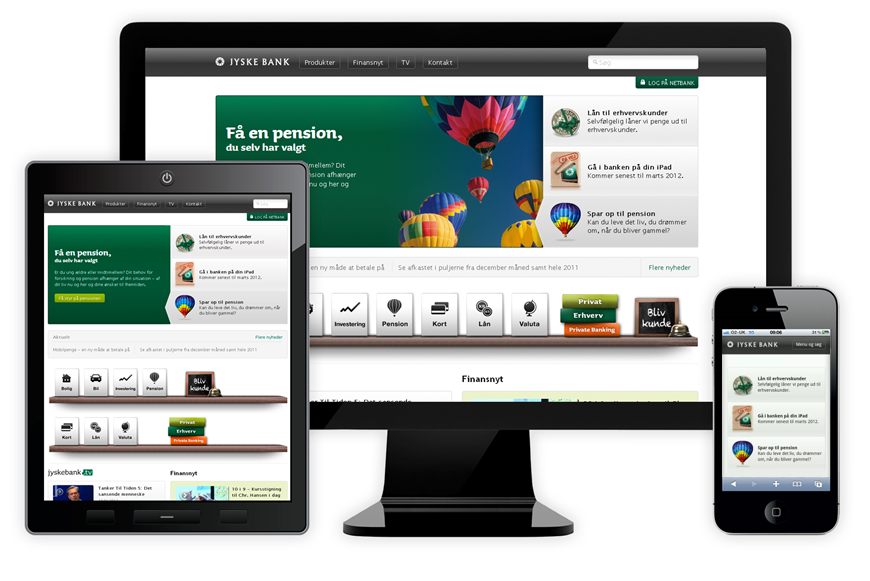
Not all smartphones are created equal, and their screens are not all the same size. So how do you design a site that is optimized for each individual smartphone without breaking the bank to do so? The answer lies inresponsive web design. Responsive design uses a single HTML5 code base to allow maximum readability and functionality across multiple types and sizes of screens; smartphones and tablets included.
It doesn’t matter if its an email, a website, or a preference center, responsive web design messages are always, and will always, be readable by end users because it adapts, reacts, and responds to whichever mobile device is trying to access it. A site designed to be 4 columns on a laptop or desktop can be 3 columns on a tablet and 2 columns on a mobile phone. The content is still the same, just the way it appears will change depending on the mobile device accessing it.
You can apply responsive web design to mobile sites as well as emails. Responsively-coded emails enables words and pictures to resize themselves so that end users will have the easiest time possible reading the email, regardless of what device they are viewing the email on. They can even show products and headlines that are specific to an individual user’s device.
The best thing about responsive web design is that it is the FUTURE. Companies and businesses everywhere are adopting responsive design into their mobile marketing strategies because, not only is is working for them now, but it will also work for them well into the future because of its adaptive capabilities.
Don’t wait! Adopt responsive web design into your mobile marketing strategy before your strategy gets left in the dust by those companies who have adopted it. Responsive web design should not be considered an option, it should be considered imperative. Any mobile marketing campaign operating with responsive web design is operating in the Dark Ages. Come out and see the light with the rest of us!


Leave a Reply
Want to join the discussion?Feel free to contribute!