In Car Mobile Search Optimization Is Now A Reality!

car_bing

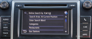
We all have our dream car picked out, for me I’d choose the Audi R8. It’s hip, it’s stylish and really cute (from a girl’s perspective). When it comes to cars though, I’ll admit I dont know much about them. As long as they go fast and look “cute,” I’m in. This is different though, it’s not about what’s on the outside anymore, it’s about what’s on the inside. What’s so fascinating about today’s world and all the technology we have going on is that car’s such as the Toyota Camry are now coming equipped with the BING in car mobile search application. Yes, that BING.

Mobile search has officially reached an all new level.

Imagine being stopped at a red light, no car’s behind you and then BAM! all of a sudden there’s a line behind you and it scared you a little bit. This is Bing! It’s officially snuck up behind us, excpet we’re not scared, we’re ecstatic, elated, intoxicated, blissfuly happy.

Most Toyota cars already come equipped with “Entune” which is a form of in-car technology which keeps you connected and updated with the most popular apps. Apps, such as bing, iheartradio, pandora and opentable to name a few. The app also keeps you updated on fuel prices, movie tickets, sports, traffic and weather. All of these services are delivered through smartphone or bluetooth services.

-The new search application requires connection to a smartphone, and the data will likely be included in the mobile segment.

-The app is not browser based, meaning the SERP is built-in.

-Search queries seem to be only local search, as of right now.

The fact that this technology will become very popular if results are positive and people enjoy it. As I stated earlier this takes mobile search to a new level, if this catches on it would raise and see that level (for all my poker fans) go bye-bye-bye.

So what is so great about this? (I assume you are asking yourself.) How would it make you feel if I told you, gone are the day’s of traveling all across the county to find a certain store. Gone are the day’s of having to search and search and search to find a good place to take a hot date.

Bing is here to help. 

No longer do you have to make a suggestion and then your date makes a suggestion and you go back and forth trying to make a decision while working a phone and driving. This makes the roads safer for others around you and you (personally) go from having a stressful date to a cohesive decision making date.

Now, I’m a St. Louis girl born and raised. We love our Anheuser-Busch, Cardinals Baseball and Toasted Ravioli. Let’s say you pick your date up and you ask her where she wants to go for dinner. After she had a long hard day at the office she say’s “I want to go somewhere where I can have an ice cold bud light, watch the birds on tv and enjoy a nice plate of ravioli.” You say okay and turn to your bing application.

Once in the application, you select restaurants, then a list will appear on the screen, American, Italian, Japanese, etc. (Too bad they don’t have a place for hole-in-the-wall sports bar, those are the best.) You select American, then another list pops up. This list will list all of the restaurant’s that fall under the “American Cuisine” category. You search for a place that sounds interesting like Patrick’s at Westport Plaza. Over 60 TV’s throughout the establishment, with the Cardinals game guaranteed to be on at least half of them. You select Patricks and viola, your map kicks into gear and guides you in the right direction on how to get there.

Next thing you know, you’re enjoying your date and the best team in baseball has forced a game seven with a walk-off in extra innings by David Freese.

Believe it or not, in-car mobile search may just be the new break through for the modern world. Bing has made a wise decision, car’s are purchased every day here and they chose the most popular car in America at the moment to market their new technology with. They themselves are also “capturing hearts of more people every month.”

Mobile SEO Part 3: Google Hates Duplicated Content

duplicate_content

This will be the third and final installment of our three part series regarding Google’s new smartphone crawler. In parts 1 and 2 we discussed how the new bot works, its impact on which types of sites will be affected and how it will affect them, and how to generate mobile redirect so that it is correctly indexed and working properly. Here, in this final installment, we will be discussing the general problems mobile platforms have when search indexing and how you can prevent them.

If you think indexing is going to be a seamless, predictable, and faultless process, stop now. This is not like doing SEO for desktop sites where there are fewer pages and fewer possibilities for things to go wrong. Ignoring risk-factors and mis-indexing will undermine your SEO efforts and will leave all forms of your site, mobile and desktop, vulnerable when Google decides to change its algorithm again.

To keep you and your company on track to reach its SEO goals and prevent mis-indexing, you should read and follow these guidelines.

The first thing you want to know is that Google hates duplicate content. They never have and they never will. It seems like the general feeling is that Google wants to avoid, or at least reduce, the need to index entire mobile pages. That’s why they are indexing and caching mobile redirects. Just by bringing mobile into the picture, you are creating possible confusion with Google where something could be misinterpreted as a duplicate.

To combat this problem, it’s important not to be sneaky. An example of a sneaky way to create duplicate content would be with something called DUST, or Duplicate URL Same Text. This occurs whenever more than one type of a URL will resolve in the address bar but the browser shows the same exact page. An easier way to comprehend this concept is by page rendering with or without the “www” in the URL. However, DUST can also be seen when there are various versions of a home or category level page.

It’s not uncommon at all for mobile platforms to control servers and databases that generate mobile content. They’re also notorious for creating a lot of DUST. The thing to remember is that a lot of mobile platforms do not really have a full understanding of SEO. Or they think they know more about SEO than they really do. So they try to set their servers to be as flexible as possible with what page requests they can create and create as many different variations of a URL as possible. However, platforms should be instead focusing on setting up the servers to 301 redirect any version of the URL that is not the canonical “chosen” to redirect the “chosen” version of the URL. You can also use this to set up your servers to avoid DUST.

Based on what we know, we do think there could be a chance that Google’s new smartphone crawler could be too literal at first, relying primarily on the redirects that are already in place without assessing other signals or algorithmic occurrences. Also, it’s probable that the crawler will have a high sensitivity to mistakes that are on a site or the redirect. Knowing this, it’s important to avoid 404 errors and misdirects.

Having mistakes on your site will hinder crawling and indexing and will position your site in a bad light. It is also possible that this could affect your desktop site too. This is why it’s important to habitually check up on your content for indexed 404 errors in Webmaster Tools. This is especially important if you creating dynamic mobile pages or using a hosted mobile solution to create your mobile pages. The easiest way to find and fix 404s is by setting up a Webmaster Tools account for your mobile content. This will eliminate the need to subtract desktop figures to create meaningful information, so you can just see the mistakes and errors related to the mobile content.

Note that a lot of 404s in mobile platforms are created by incorrectly expired mobile content. But remember to also check for 404 errors caused by a lack of capitalization normalization and trailing slash rules set up on the server. It is possible for one URL to be working, but if the same URL has a capital letter in it, or has the presence or absence of a trailing slash; it will be seen as missing. However, you can set up your server to automatically normalize URLs to remove capital letters.

It doesn’t matter if you’re getting 404s or you’re just being redirected to the home page, both are signs you have a problem. But don’t worry; this is common when conducting mobile SEO, especially when mobile platforms are in control of the server. If you’re working with an external mobile vendor, you might want to check all this out for yourself. The error-based redirect to your home page could be mis-indexed as the mobile redirect.

Mobile platforms usually don’t archive mobile pages for long periods of time, especially if the particular site is generating new and unique content on a consistent basis. However, they probably don’t have a mechanism to correctly expire the content in a manner that is good for SEO. So a similar situation could occur with a 404 error on an expired page. Usually, mobile platforms will just remove the content and leave the 404 error. But this won’t make your mobile site look good at all since while you’re creating new mobile content, there are also 404 errors being generated at the same rate.

So one has to wonder, what would happen if Google began to take these 404 errors seriously? Ideally, Google will learn to connect the 404 errors on the mobile pages to your desktop pages, but they haven’t yet. So, hopefully, right now Google isn’t letting the 404 errors hurt your site’s credibility or ranking. But, to be on the safe side, you shouldn’t risk it. Eliminate 404 errors and you will be in much better shape.

Remember when optimizing your mobile content that the smartest thing to do is play it safe. Keep your content and server settings as tight and concise as possible. Check your URLs and errors consistently to avoid risking mis-indexing. The more pages and redirects you add, the higher risk you run of being mis-indexed.

The above guidelines, along with parts 1 and 2 of this series regarding Google’s new smartphone bot, should help you better understand and take advantage of this new bot. Make sure you are paying attention to detail regularly and you should be fine. Remember, SEO can be tricky, especially tricky on mobile devices, so make sure you play it safe and play it smart.

Mobile SEO Part 2 – Creating Mobile Redirects

redirect

In part 1 of this 3 part series we covered how the new Google smartphone crawler works and which types of sites will be affected by this change. Here in Mobile SEO part 2, we will be focusing more on providing you with tips to help generate mobile redirects, improve SEO, and build on your ability to create a mobile site that can not only be found by the Google bot, but will also index your site’s content properly.

Considering the new smartphone bot caches and follows redirects once they are put in place, the ranking of pages specifically for mobile has become less important than the rankings of your actual desktop site on smartphones. Usually, you would be able to rely on the strong SEO rankings of your desktop site to out-rank mobile pages in the search, even in a smartphone’s search, but now Google automatically gives the mobile page to the end user instead of the desktop page whenever a smartphone requests a desktop page. As you can see, if you aren’t setting up your mobile redirect properly, you will encounter problems.

Since Google is not being very clear on what exactly this new bot does, it’s difficult to discern how to take advantage of it properly. So we’ll focus on what we do know.

When the Google smartbot crawls your website, it is imitating a real smartphone, therefore it’ll be following any redirects you have in place. Redirecting visitors who are using smartphones is called user-agent direction and redirection. To put it simply, when a page is requested from your server, the server will try to identify what type of device is attempting to access the page. If the user is using a smartphone the server will send the end user to a different version of the page. Note that all of this is controlled by PHP or ASP.NET code that is placed on the server and in the header of all the page templates.

Now, using what we know of Google, we’ll give you some tips on how to create redirects properly so that they will more likely be indexed.

The first type of redirect we’ll talk about is server-based redirects (301 & 302). If you’re an SEO expert you probably already know that 301 is king in the world of redirects, but 302 is a bit more common in mobile. This is due to the fact that developers don’t want to run the risk of permanent redirection, so they instead the mobile platform creates temporary mobile pages that don’t actually exist on a server anywhere. A guess would be that the smartphone crawler can cache both a 301 or 302 redirect, but the redirect has to be set as “privately cachable” in the HTML headers and must go on a permanent, indexable mobile page. The odds of Google caching on-page JavaScript or Google caching multiple versions of parameter base redirects to dynamically created pages is low. The reason for this is that all this would be way too hard to regulate and would ultimately waste a ton of space in datacenters.

Another option is having redirection set up on every page. You want to remember that you cannot always expect your visitors to enter your site from the mobile home page. If you want mobile redirects to be indexed correctly by the smartphone crawler, you’ll want to set up user-agent detection and redirection on every single page of your site. If the script of the redirection is missing from internal pages, the bot will not see the mobile pages. So if the end user clicks on the listing from the smartphone, the user will still be directed to the desktop site instead of the mobile site since it is not redirect cached.

When you’re creating your mobile redirects, you want to be sure to do it page to page. This means going through your actual desktop site and creating a mobile version for each desktop page. So if you have ten pages on your desktop site, you should have a separate ten mobile pages that replicate the desktop pages. They do not have to be identical, just similar. However, you do not want your mobile pages to be significantly different that their desktop counterparts. Make them as alike as you possibly can and setting up your mobile redirect will be much easier.

The reason that it’s important to keep your pages as similar as possible is so there is an equal amount of content on each page. Oftentimes you will see websites, especially news websites, leave out content such as articles, newstories, or blogs, and there will be no 1-1 ratio of mobile pages to desktop pages. If this happens, then you’re going to have a problem. You can solve this by eliminating redirect and giving the end user your basic desktop page on their smartphone. If you don’t want to do that, you can stick with redirect and redirect the visitor to the type of page they were looking for and insert a small message with JavaScript at the top of the page explaining to the user that the page they requested is not mobilized and, instead, they can click a link to see the desktop version of the page.

If you decide not to go with redirect and are just going to serve the end user your desktop page, a good idea would be to add a separate mobile style sheet to the desktop page template. In this case, at least your desktop content will be formatted to fit your end user’s screen, despite the fact that it’s not updated to a full mobile page template.

You can set up your mobile redirection so that all mobile users are redirected from the desktop site to the mobile site, but this is bad for SEO. It can also possibly be bad for Google’s smartphone bot. The theory is that Google’s bot is comparing the desktop content to the mobile content, and it will not redirect users to the mobile page if it thinks the two pages are not similar enough. Even if this theory proves to be false, users would still be redirected to your desktop site on their smartphones, therefore starting their search process all over again. This would only frustrate your end users and that is the last thing you want.

The next option you can consider is mirrored mobile and desktop URLs. Google would more likely consider your desktop and mobile pages similar if you use mirrored URLs. This will work, especially when replacing one page with the other, like Google’s smartphone bot does. To create mirrored URLs, all you need to do is duplicate the file structure of your desktop site onto the mobile site. The only difference will be adding either a mobile subdomain (‘m’) or a mobile subdirectory (…/m’) on the mobile alternatives.

Of course, you’re still operating under the assumption that you still have a 1-1 ratio of desktop to mobile pages. If that’s not the case, you still want to make sure your pages are at least somewhat similar. This goes for content as well as URL structures of the pages.

The last option we’ll go over is iPhone-specific handling. Remember that Google’s smartphone bot is meant to act like an iPhone. This means that your server will send to the bot exactly what it would send to an iPhone. So if you have iPhones with detailed content or a different version of the site, you want to make sure your site is crawlable. Also, make sure the content is okay to be sent to all smartphones. If you have separate pages for users without iPhones, then you’ll probably have to set up user-agent detection and redirection on your iPhone pages. This will send other types of smartphones to your other pages while overriding the automatic redirection from Google’s smartphone bot.

It’s okay to have iPhone specific advertising that is triggered by on-page JavaScript which detects the handset and shows the ad as long as it is crawlable and not redirecting to one particular page. However, if this is the case and you can’t update the settings, you’ll want to think about blocking the bot entirely.

Remember, we are still learning about Google’s new rules and its new smartphone crawler. These tips are considered mobile’s best practices based on the knowledge we have. Following these tips will most likely get your mobile site crawled and recognized by the new bot, improve the experiences of your end users, and will have a positive effect on your smartphone search ranking. You should also have your mobile content indexed the way you want.

This was part 2 of our 3 part series discussing Google’s new smartphone crawler. We will provide you with part 3 within the next few days.
Mobile SEO (Part 1 of 3)

If you don’t already know, this may come as a surprise to you. Google gives different search results to mobile phones than they do to desktop computers. Not only that, they will also serve search results based on the handset you are using. Lately, Google has been trying to algorithmically prioritize content that will work properly with the specific mobile device you are using. Google will also give lower priority to content that probably won’t work well on your specific mobile device.

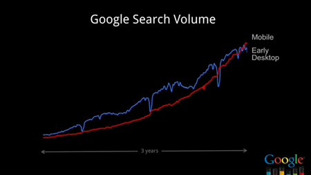
Just look at the explosion of mobile search and how it’s adoption mimics that of desktop search over a 3 year period:

google-search-volume-mobile-seo

Now, with Google implementing their new smartphone crawler, mobile SEO is changing and people and companies are going to have to adapt if they want their mobile site to be successful.

google-bot-crawler-300x237

With Google launching their new smartphone crawler, a study was done that determined how the top sites in the United States are handling their mobile site traffic. The sites were divided into 3 groups based on how they were publishing their mobile pages. The 3 types were server-side redirection, JavaScript redirection, and “cloaking” or selective serving of HTML assets. About 52% used server-side redirection, around 2% used JavaScript redirection, and about 45% used cloaking or dynamic serving. Remember, all these sites were the ones that showed without errors.

Server-side redirection is a mobile site strategy that uses two or more URLs. One is used for the desktop site, and one is used for the mobile site. The reason more than two is sometimes used is because designations can be added for tablets, WAP, and other mobile devices. The mobile site content’s ability to rank on the search results can depend on whether the mobile content is on a subdomain, a mobile directory, or a completely different domain. The mobile URLs can be static and optimized URLs, or they can be temporary dynamic URLs. Temporary dynamic URLs are usually crammed with the precise constraints of the mobile page request.

Traditionally, mobile SEO strategists relied on the rankings of desktop pages which would automatically redirect end users to mobile content whenever requested by a mobile phone. Another method they used was building independent SEO value for mobile pages so that they would rank on their own value, not the desktop pages’. This would sometimes include merging the mobile pages with the desktop pages by using the canonical tag to help share SEO value. However, the most important thing to remember is to allow both pages the ability to be crawled by search engines. This can be important for two reasons. The first is if you target a lot of WAP phone searches; they are still using a separate “mobile-only” Google index so they are not affected by the new smartphone crawler. The second reason you want your pages to be crawled is if there’s another algorithm shift in the future to where a stronger emphasis is put on mobile file size. All of this is important for a good end user mobile experience. The important thing to remember from all this is that 52% of the top million websites who use this method will probably benefit from Google’s new crawler.

The next way to publish a mobile page is through JavaScript redirection. This involves a primary and mobile URL for each page. On-page JavaScript redirect is included from the desktop page to the mobile page. The irony of this method is that the JavaScript literally depends on the failure of search engines to crawl and execute the JavaScript for it to work correctly. Usually, this method relies entirely on the desktop site to rank well in smartphone searches, while the mobile pages are blocked from search engines cataloging in the robots.txt file. This prevents any chance of replication or disorder in the catalog. Sometimes, the JavaScript is detecting particular phones and redirecting them to landing pages that are built specifically for those particular phones. This can become very tedious, but the end result is great for your end users. However, unless Google’s new crawler learns to perform JavaScript redirects, and this is highly unlikely, sites that use JavaScript will not gain anything from Google’s new smartphone crawler. In fact, as mentioned earlier, only 2% of the top million sites used this method successfully.

The third way to publish a mobile site is with cloaking or dynamic serving. This is dependent solely on one URL that can display, depending on the device that requested the page, a page with different characteristics. The content provided is decided by the server and what is usually described as a “transcoder” or “mobilization engine.” Fundamentally, this is a database of content and rules that are in various sizes and stages of regression that can be sent to phones depending on the specific phone requesting the information. Using this, a desktop computer would get the full version of the site, but a mobile device will get a comparable HTML skin. However, the mobile version of the site will have smaller elements switched in to replace the larger elements on the desktop site. All of this would be on the same URL. Note that about 45% of companies who used this style of mobile site were successful.

The bottom line is that mobile SEO is indisputably changing, yet the search engines can’t seem to agree on how to best rank and evaluate search results. The most successful people in the industry have a knack for always knowing how things work by staying up to date on how their own sites are faring and conducting their own mobile experiments. However, because of the new Google smartphone crawler, it is not enough to just test on your own phone anymore. Companies are going to have to learn to change and adapt if they want to optimize their mobile search results. Otherwise they will just get lost with all the other companies who don’t know how to optimize mobile search results.

Despite all the information we just gave you, this is just the tip of the iceberg. We will be publishing parts 2 and 3 concerning Google’s new smartphone crawler over the course of the next week.