Responsive Design | How to Implement it Correctly and Successfully

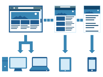
Responsive Design is the new thing in web design. This is due to its ability adapt, react, and respond to multiple screen sizes of computers, phones and tablets. With all of the different sizes of screens today and how fast they change, it is not possible or practical to build sites designed to fit to each screen size. This is why we’ve put together this article to help beginners with responsive design. Here, we will show you how to prepare to implement responsive design preparation and point out the industry best practices to help new web designers/developers learn more about responsive web design and how to implement it correctly and successfully.
1. Compatability and Functionality of Current Architecture
While responsive design is an extremely popular solution to the multiple screen size problem, it may not be the solution to every problem. There are many times when multiple web experiences would be better for the user than responsive design. When considering responsive design, certain questions should be brought up about conforming with the current information architecture. This goes in sync with assessing the functionality requirements of the web design that is currently in place. This is due to the limitations of tablet and phone devices such as the ability of older browsers to run javascript. If the current site needs alot of things that are not capable of being used across multiple platforms, then responsive design might force the web designer to rethink the functionality of the website based on the skills of in-house employees. The web experience might have to be dumbed down to allow the responsive design to work correctly for all devices.
Certain content management systems affect limits, changes, or might even completely deny websites the ability to work with responsive design. It is always a good idea for someone to check the compatibility of the current content management system to make sure responsive design will work when implemented.
2. Inspiration
Every idea in the history of man is based off of an existing idea and then tweaked to suit the needs of the new concept. Before a responsive design is implemented or even considered, it would be a good idea to browse some existing responsive design websites to see if they have the capabilities you need for what you are doing. This way, when the responsive design is implemented the design team will have a good idea of what they want to do with the web design aspect of the site. It will provide good ideas and sources for reference when in the design process.

3. Content
An extremely common mistake of a responsive design first time user is that they tend to hide content when the resolution of the screen gets smaller for the sole purpose of keeping the page looking good. It is important to keep the design looking good for any screen size, but it is also important to not penalize users for what size screen they are viewing the website from. It is possible to adjust the break points to allow a good design that will reveal all of the content. That being said, it is sometimes acceptable to reduce or hide the footer or slider on tablets and mobile screens or hide content that would not necessarily be of interest to the viewer considering the device they are viewing your site on. However, this is a tool that should be seldomly used because you always want to show as much content as you can without overloading the screen.
4. Context
Remember that screen sizes are different and some may have limitations while others have advantages. For instance, a phone might have a smaller screen than a computer, but it also can initiate calls and gain user location. It is possible to create a great user experience with responsive design if all the features of the different devices are kept in mind.
Hopefully these tips on how to implement responsive design successfully will help you and your team when designing a responsively designed website. Just keep in mind that more is not always better, and you should be happy with your final result.


